
Is this the simplest way to show what is meant by global warming? The chart below organises all the countries of the world by region, time and temperature. The trend is unmistakeable.
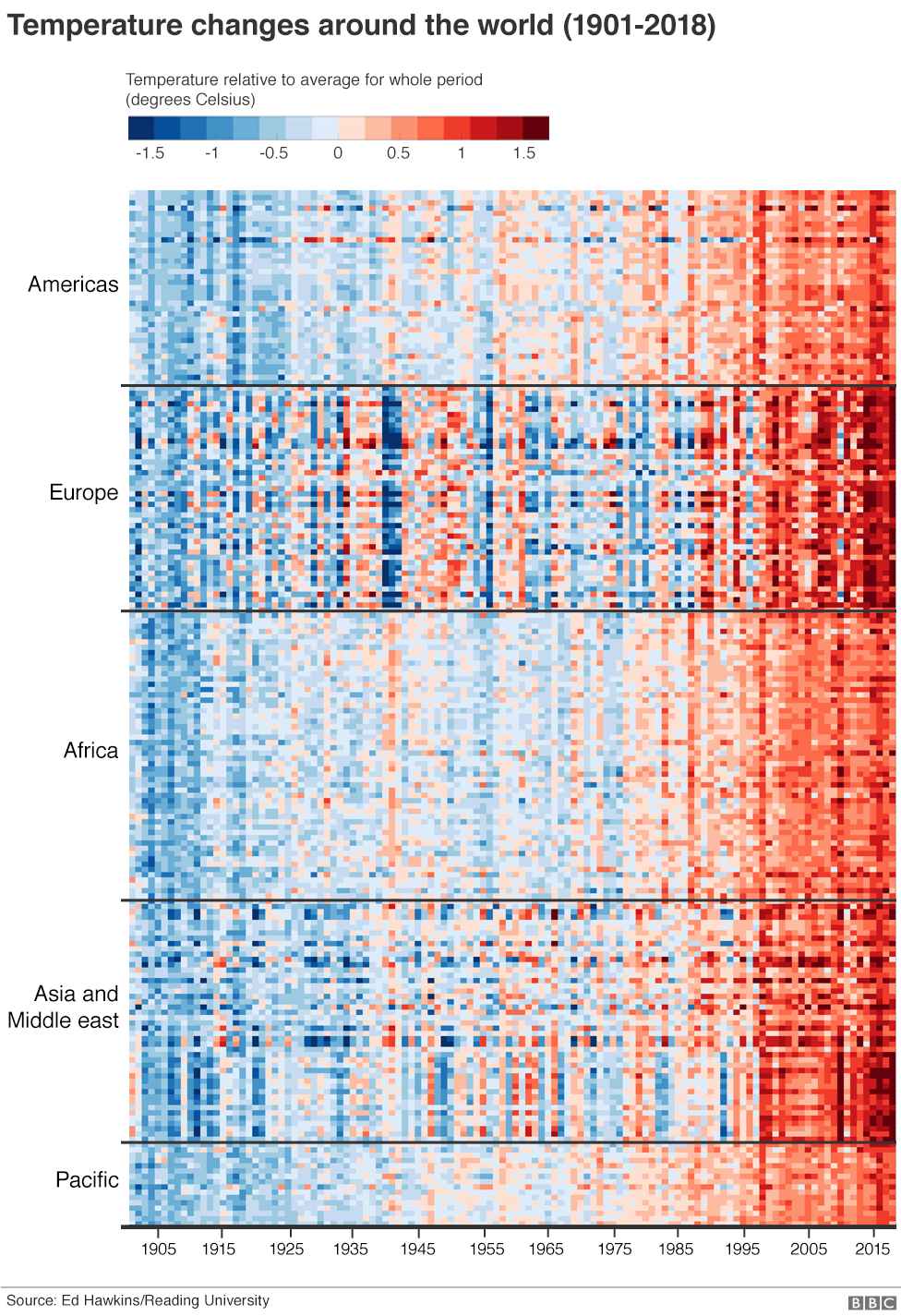

Each line of coloured pixels is the temperature record of an individual nation within its region, stacked one atop the other. Blues are cooler years; the reds are warmer. The far left is 1900; the far right is the present day.
The entire planet has got hotter, increasingly so in recent decades.
This global “Climate Stripes” graphic is the work of Prof Ed Hawkins at Reading University who has sought…
View original post 449 more words
