
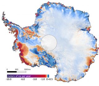
This map shows the amount of ice gained or lost by Antarctica between 2003 and 2019. Dark reds and purples show large average rates of ice loss near the coasts, while blues show smaller rates of ice gain in the interior.
(Image: © Smith et al./Science)
Two new satellite images remind us that Earth’s ice sheets are losing so much mass it’s becoming obvious from space.
In the vivid new maps published as part of an April 30 study in the journal Science, researchers illustrated 16 years of ice loss in Greenland and Antarctica as seen by a laser-emitting NASA satellite. The images paint a picture of rapid melt around the coasts of both regions (shown in red and purple in the maps)…
View original post 533 more words
